PrivateCircle
Design System — Built for Scale
2024
Overview
PrivateCircle was a 6 year old product when I joined. Over the years, more than 40 developers had built UI independently across 5 products each applying their own judgment on buttons, spacing, colours and components. The result was a fragmented experience where no two products looked or behaved the same way.
I built the first unified design system to bring consistency across all 5 products and make it easier for both designers and developers to ship faster.
The Problem
There was no single source of truth. The same button existed in multiple heights, colours and styles across different products. Developers were writing new HTML and CSS from scratch for every feature. Design reviews turned into debates about which version of a component was correct.
The deeper problem was that this was not anyone's fault. The product had grown fast over 6 years with no design system in place. By the time I joined, the technical and visual debt was significant.
My Role
Sole designer. Researched, designed and documented the entire system and worked directly with engineers to implement it across all 5 products.
Built in 1.5 months.
The Approach
The core idea was simple one HTML structure for each component shared across all 5 products, with CSS changing based on each product's font and colour system. This meant developers only had to learn one component once. Everything else was a theme layer on top.
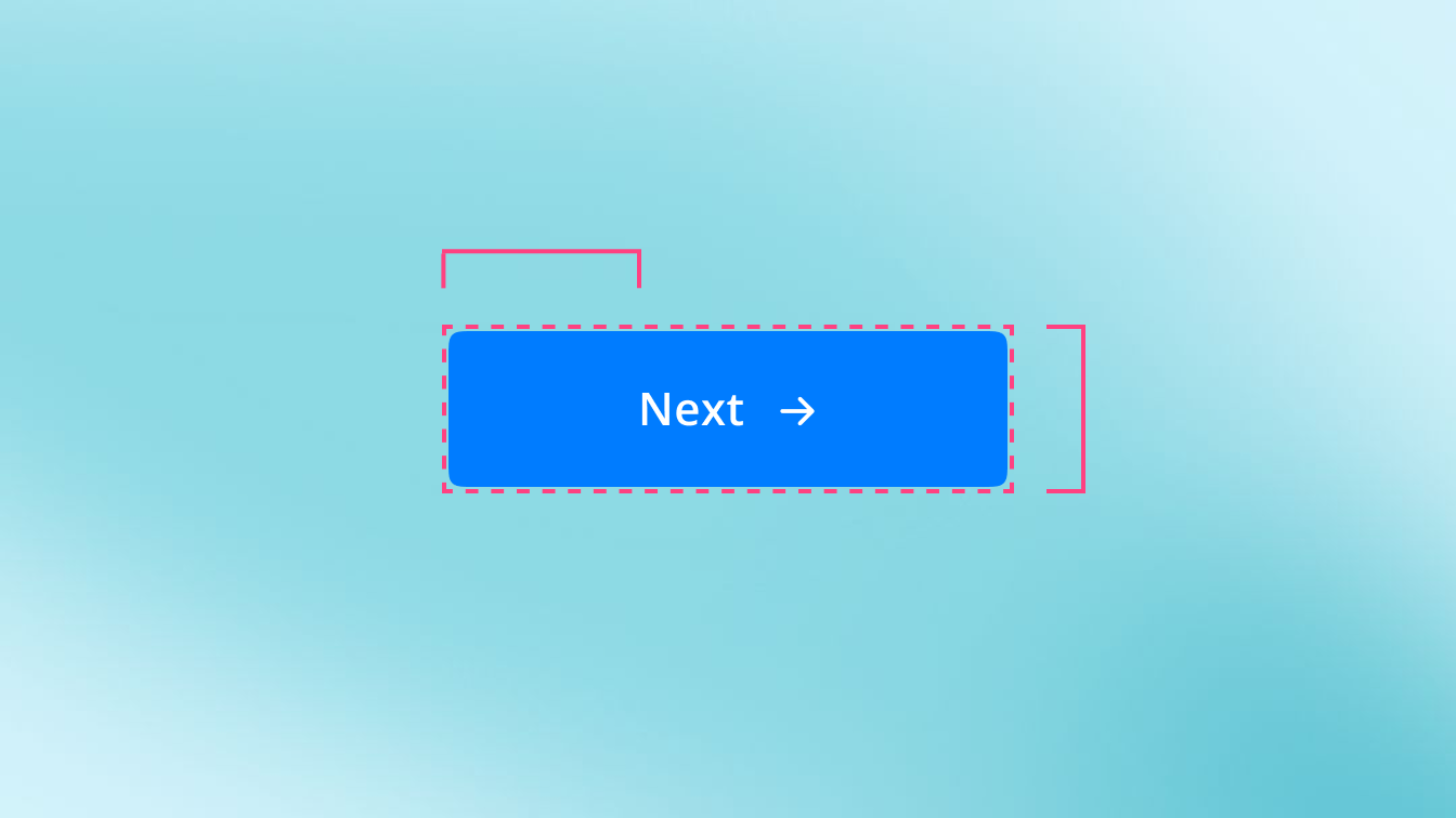
I started with buttons because they existed in the most variations and were the most visible inconsistency across products.
The Hard Part — Spacing
The most difficult part was not designing the components. It was the spacing system.
While building the first components I realised that spacing, padding and margin decisions made early would affect every component that came after. If I got the base spacing wrong, I would have to go back and rebuild everything. So before building any more components I stopped and defined the full spacing and gap system first. This added time upfront but saved significant rework later. Every component built after that used the same spacing logic consistently.
What the System Includes
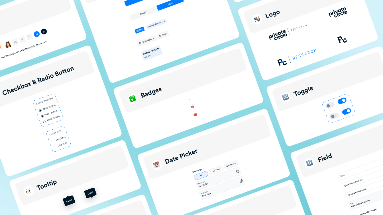
The system includes 28+ reusable components, shared color and typography tokens, a spacing and gap system, interaction states for every component, shared HTML structure with product specific CSS themes, and documentation for developer handoff.
Result
28+
Reusable components
1.5 Months
To build v1
5 Products
Using one system